
About Enterprise Insights
The Enterprise Insights screen is an enterprise-level dashboard that provides a centralized view of account health, operational activity, POS performance, and report usage across your child accounts.
Enterprise Insights consolidates data from several MealSuite systems into a single view, allowing enterprise teams to monitor trends, identify risks, and understand usage patterns without logging into individual accounts.
Accessing Enterprise Insights
From the left navigation sidebar, select Enterprise Insights > Overview.
Summary Screen
The Summary screen provides a high-level overview of current data across each of your child accounts, allowing you to see any drops or spikes or other unexpected changes for a specific facility.
Quick View Tiles
The following tiles are displayed at the top of the screen for a quick view of the respective information
- Total Accounts - number of child accounts.
- Sensor Alerts - number of active temperature sensor alerts across your child accounts.
- Tickets Today - number of active support tickets across your child accounts.
- Active Projects - number of active projects in the implementation phase with MealSuite.
Facility Data Table
The data displayed for each child account is represented in the onscreen table, described as follows:
| Section | Column | Description |
| Facility | ID | Facility ID |
| Account Name | Account name of facility | |
| Account Health | Health |
Overall health score between 1 (worst) and 10 (best) with color-coded badges indicating the following:
|
| Tickets | Number of current tickets submitted to MealSuite Support. | |
| Subscriptions | List of active subscription services. | |
| Projects | Number of active projects in implementation phase with MealSuite. | |
| Stripe | Current status for Stripe payment (OK or Blocked) | |
| Temp Sensors | Active | Number of active temperature sensors. |
| Alerts | Number of alerts from the active temperature sensors. | |
| HACCP - Food Temps Logged | 24 | Number of food temperatures logged within last 24 hours. |
| 7D | Number of food temperatures logged within last seven days. | |
| Orders | Today | Number of orders for today. |
| 7d | Number of orders from last seven days. | |
| People | Diners | Number of resident/patient profiles. |
| Connect Messages - 48 hr | Number of Connect messages receives in last 48 hours. | |
| Menus | Standard | Number of standard menus scheduled. |
| Snack | Number of snack menus scheduled. | |
| Special | Number of special event menus scheduled. | |
| AA | Number of Also Available menus scheduled. | |
| Inventory | 30d | |
| Open | Number of open PO's (not yet submitted) | |
| POs (Purchase Orders) | Number of submitted PO's | |
| Point of Sale | Tkts 24h | Number of order tickets in last 24 hours. |
| Tkts 7d | Number of order tickets in last seven days. | |
| Tkts 30d | Number of order tickets in last 30 days. | |
| Bill to Room (30d) | Number of bill-to-room transactions in last 30 days. | |
| MP Credit (30d) | Number of meal plan credit transactions applied in last 30 days. | |
| MP Decline (30D) | Number of meal plan debit transactions applied in last 30 days. |
Note: Depending on the data type, a 0 does not necessarily mean an issue, and instead means that the facility is not using the function of that data type.
Viewing Dashboard Screen of a Select Facility
By clicking on a specific facility row, a dashboard screen for the facility appears, presenting the information in a more user-friendly and organized layout (screenshot below).
You can generate data for a specific date range by selecting the date range at the top right corner.
The following information is displayed on a facility dashboard screen:
- Health Score - current health score of account (Red - concerning, Orange - moderate account to watch closely, Green - healthy or stable account).
- Open Tickets - number of open support tickets
- Account age - age of account.
- Products & Usage
- Temperature Sensors - sensors name, current temperature, current status, and last reading.
- Temperature Logging - the temperatures recorded for the selected date range, broken down my kitchen temperature records, and meal delivery temperature records.
- Orders - number of orders in the date range, broken down by Advanced Ordering, Portal app, POS and Tableside Select (aka Instant Ordering)
- Report Usage - broken down by printed reports from the Core system and paperless reports generated in the Touch app.
- Assigned Users - displays user information for each assigned user to the account: first name, last name, email address, number of logins for the selected date range, and last login.
Exporting Data from the Summary Screen
The current data displayed on the Summary screen can be exported to an .csv file. To do so, click the Export link at the right side of the screen and select Download as CSV.
POS Performance Screen
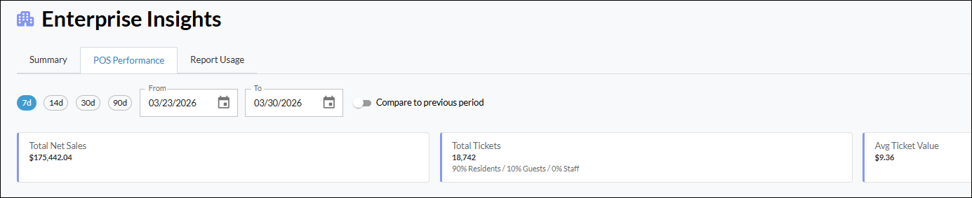
The POS Performance screen provides an overview of POS transaction activity across your facilities for a selected date range, helping you identify trends and overall performance. This screen displays data in the following sections:
Total Net Sales, Total Tickets, and Average Ticket value
Daily Net Sales by Site
Provides an interactive graph to view daily net sales across your sites.
Ticket By Diner Type
Displays tickets by diner type.
Revenue by Payment Method
Displays revenue by payment method (e.g., bill to room, credit card, etc.).
Comparing to Previous Period
When you select a date range to display POS transaction data, there is also the Compare to previous period option. With this option selected, the screen will display comparison data for the equal date range prior to the currently-selected date range. For example, assume, the date range is seven days from May 7 to May 21. With the Compare to previous period option selected, the data from the seven days prior to May 7 (April 22 to May 7) is displayed.
Site Comparison Table
The Site Comparison table lists the following for each site:
- Net Sales
- Tickets
- Average Ticket
- Resident (count)
- Staff (count)
- Guest (count)
- Cash
- Credit Card
- Bill to Room
Report Usage
The Report Usage section shows the number of Touch app paperless reports generated and the number of Core reports that were generated across a selected date range (Core reports are physically printed after being generated). Note that 0 usage may be expected depending on system adoption.
Report usage data can be exported via the Export link at top right corner.